Essential Elements Of Great Website Design In 5 Minutes Without The Sweat And Tears
First impressions are everything and you never get a second chance with website design. Your homepage should stand out from first site. Your website should encourage users to dwell more, click further and continue exploring. We have collected our thoughts here at Digital Web World on some of the key elements of great website design and have shared these for you.
Create A Killer Headline (And Sub-Headline)
You only have literally seconds to make the first impression with your headline. It should give the viewer a clear idea of the subject of the page they are about to read/view.
Clear enticing headlines pulling the viewer into the Webpage, clearing Sub-headlines to give you a chance to share more information about what you do and offer.
Here is a top tip for creating Killer headlines instantly. Think about writing headlines for Web, blogs etc in this format.
What the customer wants + In a time period + killing the objection.
So for example great headlines are offering the viewer something that is relevant within a time period say 3 minutes or 30 days, whatever the time period is.
The killer objections are defusing the normal objections you will get from any person viewing
Here are a few examples.
- Totally Clear Skin in less than 90 days without the use of drugs.
- Become a Web Designer in 3 months by studying only 1 hour per day.
- You can make £300 per day with just one hour per week of time without expensive Web tools.
Remember the offer comes first in your Website landing page headline.
Second top tip is to limit the use of ‘best ever’, ‘most popular’, ‘greatest ever’, all of this is considered rubbish for the viewer of your webpage who will read every day. Try being accurate with data that supports claims ‘3x as effective’ works a lot better in text.
The Most Important Design Element – Your Visual Hierarchy
Most people like images (or videos), they are simple to digest and help to get across a message without the need for words. Think about what your business objectives are. What solutions are you selling to customers problems? Make sure that the visuals on the page are viewed in a hierarchy. 1, 2, 3, 4 etc placing a number against the visual that is most striking on your website. Do it now?
Look at the following image and place a number against the visual hierarchy on the page.
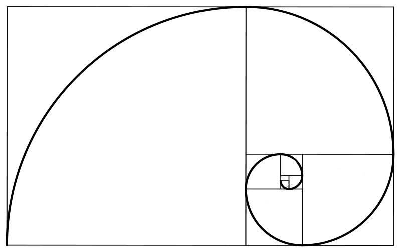
The Golden Ratio is very similar in its Fibonacci Sequence and describes the rule of thirds for great Website Design, but is also applicable to design in general.
The Golden Ratio
Also proportioned to 1.618* the Golden ratio is a statement on design proportions which has been designed into great aesthetically pleasing design for well over 3,000 years. The principle is based on a rectangle whose ratio of the longer side to the shorter side is 1.618. The classic view of this is the Pantheon in Athens where the design can be applied to the building of the Pantheon in its form.
This same principle is now used by many designers most notably in the designing of Twitter where you have probably received this notification from.
Display images of the office you work in or create a short video that showcases what the business does and/or the products/services you offer. Try and place these at the top of the page (or if not, anywhere above the fold works well) as people will want to see some visual elements when they first enter on a page.
Call To Action (Sometimes Referred To As Fitts’s Law)
Each page on the website should have a compelling call-to-action that draws the user to a conversion. For example, linking to a page where you can make a purchase or including a sign up form built into the page). This also benefits SEO in a great way because you will be interlinking between pages, giving authority to pages that may not get enough traffic otherwise.
However there is a designer ‘law’ that determines the size of the button’s that decides on the priority of the buttons. This priority ’size’ is purely to get the user to take action, more specifically a ‘call to action’. This is called Fitts’s law and stipulates that the time required to take that call to action e.g. hit that call action button, is a function of the distance from where the mouse currently is to the button and the size of the respective button. So the larger the object from where your mouse currently is and your eyes are. Fitts’s law follows a logarithm and therefore is a curve and not a straight line, so overdosing the size of a button will equally have a detrimental effect on its use. The proportion of button size is equally important and should therefore be larger for the actions you want a viewer to take.
The ‘Law’ of Choice
Choice is good right?
…Well to a point it is, but if the choice becomes too great on a Website you will cause paralysis of the viewer. They will simply have too many options to choose from and they will become paralysed by choice. So how do you know what is the correct number of choices?
Well you don’t, but you can make it easier for the viewer by providing filters to enable them to change what they are selecting and help them narrow down the choice. This self selecting use of menus is the best option. Limit the number of options and get the customers to eliminate by the use of filters.
Testimonials And Portfolios
Having case studies from real clients gives your website a huge boost in terms of creating trust. It’s a good idea to show off your portfolio and any short, written testimonials from previous customers on the homepage. Make sure examples in the portfolio include a lot of information and images, so potential clients get an idea of what you could do for them.
Put a name and image to testimonials as well (with consent of the individual of course).
Navigation
The crux of any website, visitors need to be able to access different areas of the website with ease. Include primary, secondary and tertiary drop down menus as necessary and create compelling headers so users will be interested and know what they are clicking on.
Visibility is key for a website and users should be able discover what they are looking without hardly any efforts.
Resources
You need to slowly build up trust with viewers before they will decide on whether to make purchase or not. One way of building this relationship is to include resources on certain pages where they can learn more and make an informed decision, statistically speaking after the 5th visit.
Recognition
Show off any awards or badges you have earned on your website. These can include SSL badges, website security and recognized partner badges (like Google, Bing, BIMA or RAR+ awards, if you are an agency for example).
This shows credibility trustworthiness in your field in addition to any testimonials that you may receive.
So in summary:
- Use Visual Hierarchy – build using this key principle.
- Create Killer Headlines that show off your offers.
- Use the Fibonacci sequence and the Golden Rule.
- Call to Action and Fitts’s Law.
- Law of Choice remember to use filters to get your viewer to narrow down their choices.
- Testimonials and Case Studies – make sure you have some.
- FREE Resources – make some resources free on your Website.
- Recognition – show off your credentials.
Your website is a Funnel and the home page is the beginning of that journey. According to an excellent article first published by Affiliate Marketing back in 2015: http://www.affiliatemarketertraining.com/good-average-time-site-per-visitor/ dwell time on a Website if under 30 seconds is considered awful anything up to 2 minutes is considered Average and anything over 2 minutes is considered outstanding. How good is yours ?
We know that the end of the funnel occurs when the user has gone through the whole process and made a purchase or signed-up to the mailing list. Your design objective has been achieved when your user has completed your objective. The user experience and the objective for the page will be aligned. Remember this when utilising these essential elements of great website design.






Leave A Comment